gener8tor
gener8tor is a nationally-ranked venture capital firm and accelerator that brings together startup founders, investors, corporations, job seekers, universities, musicians and artists. Their platform includes more than 75 programs spanning startup accelerators, corporate programming, speaker series, conferences, skills accelerators and fellowships.
gener8tor needed a brand that would exude their ambitions and embody a culture of authenticity and opportunity. On the inside, the company was full of bold, risk-takers who’s primary mission was to partner with communities to invest in their best and brightest. Externally, their brand wasn’t carrying them through the next wave of their success – it was
10 years old and didn’t keep up with the growth of the business. After adding several new programs, partners and team members, gener8tor needed a brand that was flexible, bold, strong and something that would accommodate continued fast growth. Challenge accepted.
SERVICES PROVIDED
Brand Strategy
Brand Growth Strategy
Visual Identity
Brand Support
Web Design
Social Media Voice
As a top performing accelerator, gener8tor is beloved by its participants, but the previous brand lacked energy and cohesion. It was time for the industry to immediately understand its distinction.
Brand Strategy
gener8tor was born to uplift entrepreneurs and communities that are often times overlooked within the venture capital world. The company is a passionate, vibrant, diverse, and inclusive organization that cares for its Founders, Partners and program participants. As the new internal Creative Lead, I singularly kicked the branding project off by getting to know the gener8tor employees in order to understand gener8tor’s brand attributes –– energetic, strong, inclusive, bold. Although "success" is an important outcome for Founders, we focused on "bold" for the visual strategy to avoid coming off as insincere. “Bold” is the attribute that guided my choices. “Inclusive + Strong” is the outcome that conveyed through verbal identity. A huge portion of gener8tor’s mission is to create generational wealth in communities outside of the major tech hubs, because we believe that Founders in middle
America have the chops to succeed as much as Silicon Valley Founders. Additionally, Black and Brown Founders recieve less than 1% of venture capital and gener8tor is committed to closing the funding gap.
In addition to brand attributes, it was very important to have balance between the primary gener8tor brand and the need to extend support and flexibility to external relationships between Sponsors and Partners who help make gener8tor programming possible. The incredible relationships that gener8tor extends to it’s Partnerships has been apparent since day 1 and the brand needs to convey the next-level service that gener8tor is committed to for fast-paced future-growth.
Mission, Vision and Verbal Identity
The new verbal identity conveys the confident, fast-paced ambition of gener8tor. It’s a company full of young, eager, thought-leaders who have a lot to say about the impact they’re making within communities. These feelings mold together, blurring the lines between work and life with the distinct character of both.
The gener8tor brand voice is bold, strong, and full of energy. To them, Startups thrive with collaboration, networks and human-to-human connection. Their voice reflects their capability, resilience, and experience – and makes others feel capable in return. They are vibrant, encouraging, and driven.
Logo
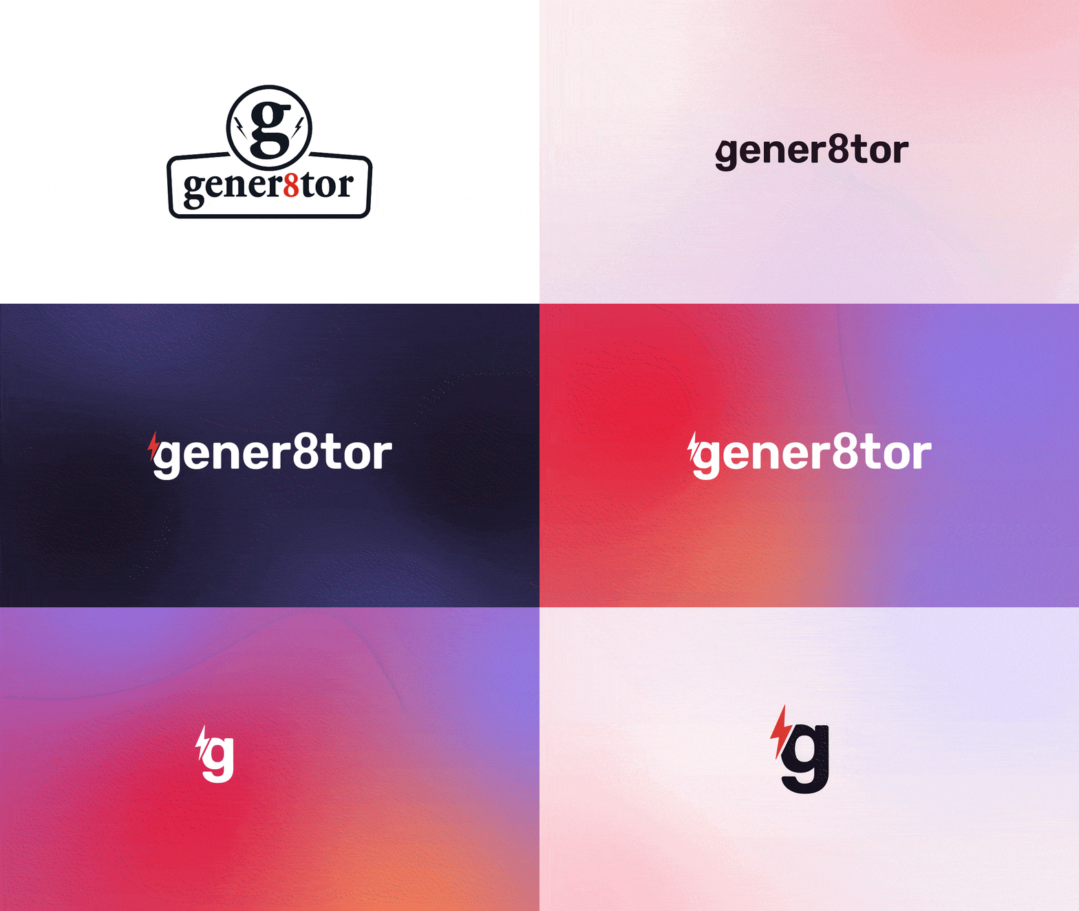
gener8tor’s logotype is a simplistic, custom logotype built on the bones of the typeface Rubik and contains the company’s signature slanted lightning bolt that serves as bold anchor.
The sleek monogram is a short–hand of the primary logotype to give the visual identity distinction in small instances, such as an app icon, favicon or in small format collateral.
Sub-brands and Partnership Brands
gener8tor requires ongoing solutions for both sub-brands and Partner and Sponsor-driven brands. With each accelerator and program being strinkingly different from one another, yet beneath the same parent brand, I came up with a branded house solution to help increase brand awareness. In the past, individual programs acted as a separate entity, which confused participants and applicants. Who was gener8tor?
By attaching the primary brand to each program, we’re training the industry to understand gener8tor’s offerings and extensive expertise, while still offering a visually unique aesthetic with custom palettes and web presence.
Visual Identity
Hello, bold, timeless, energetic colors.
The visual system has polish and personality: familiar typography adds comfortability and trust, while carefully curated photography feels non-intimidating and genuine. The primary gener8tor color palette gives a nod to the previous “red” with a more vibrant tone. The program colors
oftentimes live separately from one another, but are able to act as a cohesive family when necessary. Each color was carefully chosen to integrate into the primary brand colors seamlessly.
The secondary palette is reserved for product lines.
Typography: Roboto is gener8tor’s lead display typeface. Its mixture of classic and practicality make it an ownable san serif family that feels sincere and intentional. It’s a workhorse typeface that is slightly condensed and showcases humanist qualities. By using the family member Serif as a supporting font, gener8tor is able to create an alternative digital aesthetic when necessary, while staying cohesive.
Photography
I defined two distinct photography styles: portrait and environmental. For the primary headshot style, I wanted to complement the core color palette by having something that felt strong, yet inviting with authentic expressions and a neutral toned background that complements gener8tor Midnight. This simplistic approach also helps contrast other photography styles and the visual language system.
A secondary style leans on environment and light to portray a glimpse of the gener8tor lifestyle. The individual subjects are camera unaware to better complement and not compete with headshot styles. This tone comes to life through high-energy events, collaboration, and a local play on our communities; never overly-curated, but genuine and authentic.
Information Architecture + User Experience
For the UXUI portion of this project, I started with the overall site architecture. Before overhauling the IA, gener8tor’s individual programs were all living on separate domains and existing in silos. In order to streamline the brand, user experience and create an all encompassing environment, I broke up the programs into six main categories (shown below.) Then, I took it a level deeper and explained the type of participant that could be drawn to each category; an Artist, Career-Seeker, Startup and so on.
By breaking gener8tor’s programming up into categories, I was able to not only give the user a better overall experience, but create a clear journey creating leads, partnerships and a 43% increase in number of applicants.
For a user who is new to the world of accelerators, the short and subtle descriptions are also used as educational material as they move throughout the website. Consistent language was very important here.
Website Design + User Experience
gener8tor has many moving pieces – from accelerators to corporate partnerships to events and more. My biggest challenge was creating landing pages for every program market to ensure new market pages could be
created quickly and efficiently with dynamic content. My next biggest challenge? It had to be done on Squarespace. 😳
Product Line Brand Support
At it’s core, gener8tor’s product is its variety of programming. Many of the external marketing initiatives consist of special announcements and/or awards, cohort exposure, new and upcoming programs and gener8tor’s mission-oriented goals. With 100+ programs running simultaneously throughout the year, gener8tor wanted their marketing to feel cohesive, but also special highlighting either industry or market focus.
I was able to create a consistent visual identity through consistent website hero images, website landing page templates, Mailchimp templates, reusable event collateral, social media posts, paid ad designs and more. Prioritizing and accounting for all of these additional elements helps to quickly establish consistency across the gener8tor experience and brand voice.


